Ethnic groups in the US are distributed unevenly across the nation. The animations below show where they are located and how large they are in relationship to each other. We looked at five different broad ethnic groups: Europeans, East & South Asians, Hispanic and Portuguese and African American. The ‘Other’ group includes all other groups including Native Americans. We used the registered voter data from L2 Political to do this ethnic analysis.
Americans of European descent are shown in blue. This is by far the most populous group and they are represented all over the country. When you look at the European Americans it is interesting to see that 75% of the population of the US lives East of the Mississippi river. East and South Asian Americans are shown in red. They are most concentrated in three metropolitan areas; Los Angeles, San Francisco and New York City with smaller groups in Washington DC, Chicago, Houston and Seattle. The group of Hispanic Americans is much larger than Asian Americans. Hispanics are concentrated along the border with Mexico, in California, Florida, Texas and in New York City. Of course there are groups of Hispanics in rural areas but the numbers are fairly small so they do not show up as big ‘bubbles’ in the 3D model. With the exception of Los Angeles African Americans are almost entirely concentrated East of the Mississippi with large groups in the deep South and along the Gulf of Mexico.
This second animation shows the distribution of broad ethnic groups in the state of California.
We are looking at California from the Pacific Ocean. Asian Americans are shown in red. They are largely concentrated in Los Angeles and the San Francisco Bay Area with smaller groups around San Diego and Sacramento. Americans of European descent are the most populous group and are shown in blue. Hispanic American voters are shown in green. The largest numbers of Hispanics are Los Angeles and the San Francisco Bay Area but large groups also populate the agricultural areas in the central valley. African Americans are almost exclusively concentrated in Los Angeles and the Bay Area. The animation also shows multiple groups at the same time which makes it easy to compare how large the different ethnic groups are in different parts of the state. At the end of the animation all groups are shown. Los Angeles contains by far the largest number of people with the Bay Area a close second.
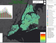
The third animation shows the distribution of ethnic groups in New York City.
In this animation we show the voters in New York City as cylinders. European American (shown in blue) are evenly distributed throughout New York with the highest concentration in Manhattan. Asian Americans (in red) are concentrated in the south tip of Brooklyn and the south tip of Manhattan as well as Queens. Hispanic Americans are heavily concentrated in upper Brooklyn and the Bronx. African Americans are much more clustered than the other groups. The largest group is in lower Brooklyn as well as in Harlem, Jamaica and St. Albans.
The above animations were created in the following way. L2 Political collected all registered voter data from the states and counties and compiled this into a file with 160 million voters. Moonshadow geocoded all voter addresses and loaded the entire voter file into VoterMapping. The VoterMapping software is based on Moonshadow’s patented Ephemeris geospatial database engine. With Ephemeris databases with hundreds of millions of records can be visualized instantly. Moonshadow has developed an experimental version of Ephemeris that can output millions of records as a 3D model instantly. Users can ‘fly’ through the 3D data model in real time, make data selections and change the way the data is visualized. The 3D visualization version of Ephemeris was used to create the 3D model and render the animations as an MP4.


